Why We Love the Work Center
June 22, 2022Why We Love the Strategy Health Map

What if choosing strategy software didn’t require going down the search engine rabbit hole? After researching a handful of options, a few may even start sounding the same. So how do you make the best choice for your team? MPOWR Envision believes your choice is easy when you understand the ins and outs of a software platform.
With that in mind, we are showcasing our favorite features and why we love them. In doing so, we hope this helps you make an informed decision on which product will best meet the needs of your organization.
Many strategy software products promise to reach your strategic objectives. However, at the end of the day it comes down to these three questions:
- Can your team learn and adopt the software with ease?
- Will you actually be able to plan, track, and achieve your strategic goals?
- Will you see real results from using this software?
One by one we’re giving you a breakdown of how MPOWR Envision answers these questions. With that in mind, here’s why we love the strategy health map.
What is the Strategy Health Map?
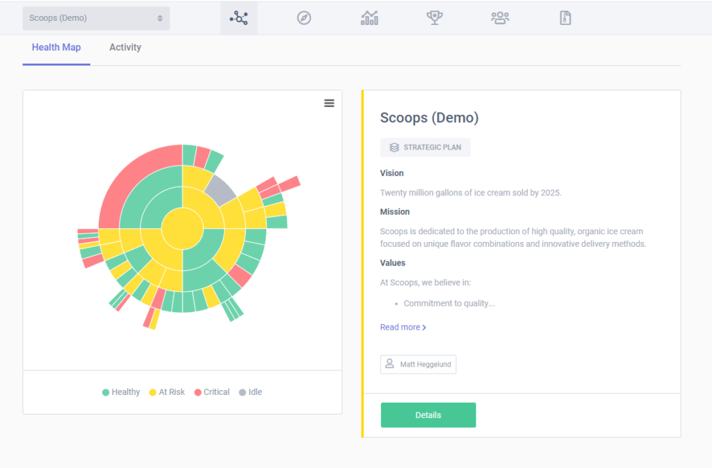
To keep it short and sweet, the strategy health map shows your organization’s progress. Every organization needs a straightforward tool that provides an updated status of all its projects. Our automated health algorithm does just that. It gives everyone on your team a summary of the organization’s strategy as a whole and a summary of each individual portion of the business. One simple glance and you will know whether your plan and organization’s operations are meeting expectations or falling behind.
Why We Love the Strategy Health Map
It’s important to us that your team doesn’t spend extra time trying to decipher a coded system. That’s why the strategy health map operates using this universal color system:
Green: Healthy
Yellow: At Risk
Red: Critical
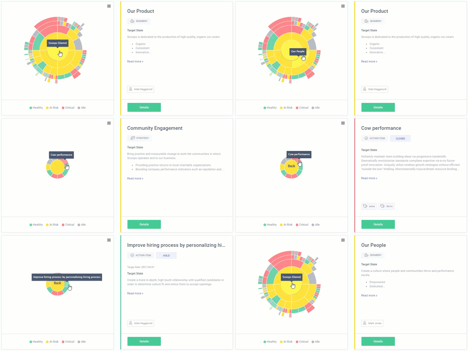
The MPOWR Envision health map shows you which parts of your strategic plan are meeting expectations, which aren’t, and the causes behind those statuses. Because our map is a sunburst chart, users can easily follow the trail of projects that impact the cumulative health of their strategy. Seeing your plan’s updates is just one click away. There’s no longer a need to ask your peers for the source of delays. The map shows it all.
While competitors may provide other kinds of strategy maps, some of them aren’t as easy to operate. We are fans of our sunburst structure because it’s easy to find, quick to read, and without endless scrolling to view the entire plan. With the MPOWR Envision health map, you truly see everything your organization encompasses on one page, in one glance.

What You Can Do with the Strategy Health Map
Need a closer look at a particular segment of the map? Hover your cursor over the chart to reveal segment names and click the individual segments for a deeper look. You can navigate through your entire strategic plan with just a few clicks.
Are you wondering how projects are going that are under other team members? The health map shows their status and never gatekeeps data. You are always connected and always have access to the ongoings of your organization, no matter what role you play.
Pro Tip
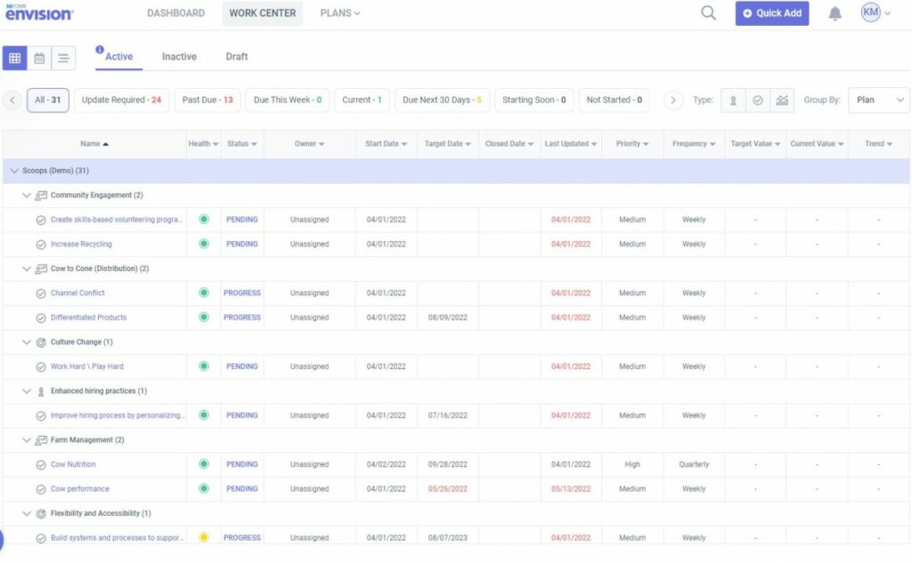
Above the health map you’ll find a summary bar of at-risk warnings, new progress notes, and past due items. Clicking into these summaries will populate every item that falls under that category. Say goodbye to lengthy searches for which projects are on track or behind schedule.

